//experiment 002
OCEAN CLUB
Identity
Editorial
Digital Media
Illustrator
Photoshop
InDesign

//01
CONTEXT
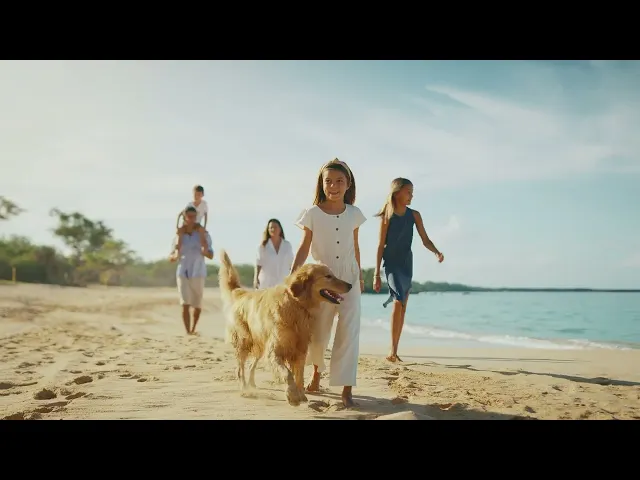
Ocean Club is a luxury beachfront residential building in Barra Velha, Santa Catarina, with units starting at around two million reais.
When the project started, the client only had the architectural renders and the logo. There was no defined palette, typography, or visual language yet.
My role was to build the visual identity and apply it across the launch materials, from the first pre-launch campaign to later adjustments during the project.
//02
problem
The challenge was launching a high-end real estate project without an established visual system.
The brand needed a consistent language that could work across many formats: sales presentations, printed materials, digital campaigns and the physical sales environment.
At the same time, the identity needed to communicate luxury in a way that resonates with the Brazilian real estate market.
//03
Decisions
Color palette
The palette came from the project’s surroundings: blue-green tones from the ocean, a warm sand color inspired by the beach, and white referencing sea foam. These colors helped visually connect the building to its beachfront location.

Marble as a graphic element
The interiors of the building use green marble. Instead of limiting it to the renders, I incorporated the texture as a graphic element across the campaign materials, creating a visual thread between the architecture and the brand.


Two launch phases
The campaign unfolded in two stages.
Pre-launch included presentation decks, ads, invitations, email marketing, banners for the sales space, broker materials, social media and WhatsApp assets.
Launch expanded the system into billboards, a printed booklet, updated presentations, flyers, video titles and screen content for the sales environment.


//04
Constraint
About six months into the project, a new marketing manager introduced a different visual direction.
The brand shifted toward a cleaner and more minimal style, removing textures and moving the palette from ocean tones to gray and yellow.
My role was to adapt the existing materials to this new direction while keeping the campaign consistent.


//05
Result
//06
Reflection
My previous experience working with real estate developments influenced many of the visual decisions in this project. Looking back, there are things I would approach differently today, but the project played an important role in shaping how I think about branding and communication for real estate developments.